Is the Stock Market in for Three Lost Decades?
Did you know that between 1970 and 2000, the stock market went through not one but nearly THREE lost decades?
There’s a theory in behavioral economics called the “money illusion.”
It argues that people tend to measure their wealth in nominal terms. And although they understand inflation and have enough math acumen to do percentages, they simply don’t — for whatever reason.
Take the notion of being a millionaire, for example. Despite the fact that the dollar doesn’t go nearly as far as it once did, it persists as a symbol of wealth to this day, and is a staple message in ads, tabloid headlines, and, of course, book titles:
But being a millionaire isn't the epitome of real success anymore. Over the past 50 years, the dollar lost about 85% of its value. And with a real million dollars today you could barely afford a one-bedroom condo in SF.
Not that much of the “American Dream” if you ask me.
If anything, an “inflation-adjusted” millionaire today should have a net worth of at least $7.5 million. (Take note, Penguin Books.)
Same with salaries.
I read a study once that found that workers would see a 2% wage cut at zero inflation as unfair. Yet, they’d be happy with a 2% wage increase at 4% inflation, even though they would lose purchasing power either way. It’s all in the perception.
In the end, this psychological quirk makes it seem we are richer than we actually are.
I suppose that’s the reason workers failed to negotiate higher real wages for nearly two decades despite corporations shelling tens of trillions to shareholders in dividends and buybacks.
(Side note: when inflation is as biting as it is today, people do start to become more conscious of what their dollars can buy. So today this phenomenon may be less pronounced than it was during the last two decades of low inflation.)
But the money illusion doesn’t just affect people’s personal finances. It plays on the market’s psyche, too.
Was the 1970s a lost decade or nearly three decades?
If you scour the mainstream media, notice how much data, especially historical references, are nominal vs. inflation adjusted. I did an anecdotal study the other day and looked at 20-30 well-shared data points/charts.
And surprise, surprise, 9 out of 10 were nominal data that often gloss over important things—especially when you’re referencing and drawing parallels with longer-term or even multi-decade timeframes.
Take the 1970s.
The financial media is buzzing with parallels between today’s bear market and the one that began in 1971 after the first inflation uptick. And they’ve come to the same seemingly reassuring conclusion.
The stock market cratered then plateaued for a while. But when Volcker clamped down on inflation and later dropped the rates, stocks launched into a massive, multi-decade structural bull market.
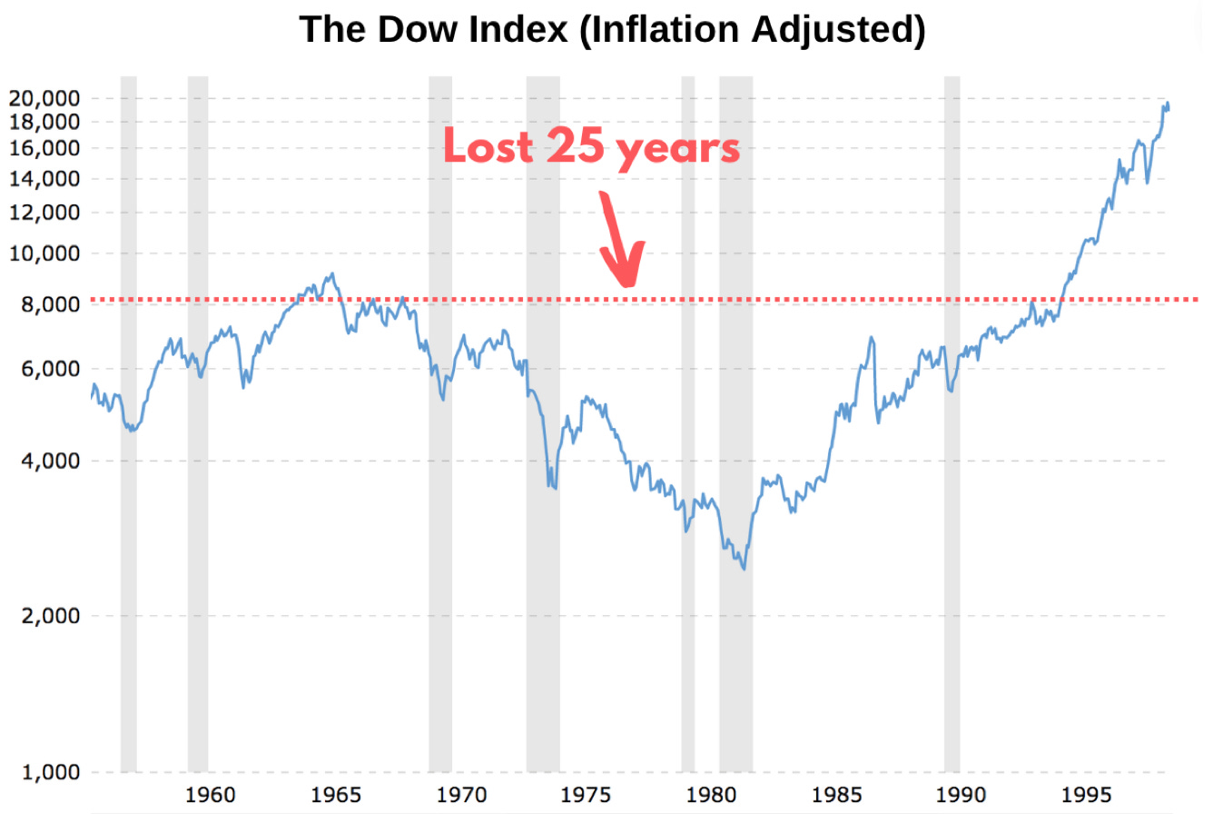
And they are right in nominal terms. The Dow had something of a lost decade—which was already bad enough for those investors with shorter timeframes. But after 1982, it more than tripled in five years and made up for lost time.
That indeed sounds reassuring for longer-term investors.
In 15 awful years, starting from Jan 1970, you’d have still made a 98% nominal return. That comes to 4.7% annualized return. It’s not that bad given stocks haven’t budged two-thirds of that time, right?
But if you take into account how much purchasing power the dollar lost during the 1970s, it took, get this, 25 years—or half the average person’s working life—for the Dow to bounce back:
That’s how the money illusion can fool investors into believing their investments are returning more than they actually are. And as we've just witnessed here, they can also significantly skew historical comparisons.
Money illusion masks fundamentals during inflationary periods
Nominal numbers don’t just distort real returns.
In the case of stocks, they embroider fundamentals like revenues, and in turn, earnings, which, on their part, spruce up valuation ratios that investors rely on to gauge if the stock is reasonably priced.
A good example would be to look at earnings from a nominal vs. inflation-adjusted perspective.
First, let’s look at where the S&P 500’s EPS currently is—the number you most often see in headlines as an earnings benchmark. This metric is calculated by dividing after-tax profit by the outstanding number of shares.
In the second quarter of 2022, the S&P 500’s trailing 12-month EPS (blue line) hit an all-time record. The next 12-month forecast is tapering off, but it isn’t that bad either:
What “earnings recession,” right?
If we drill down a bit deeper and look at the percentage growth, earnings already become not as impressive. In the second quarter, EPS growth (YoY) came down to just under 10%:
Sure, this doesn’t call for a celebration, but again, it isn’t awful either. In fact, for much of the last decade, which brought the longest bull market in history, earnings growth hovered around the same level.
Let alone the earnings contraction that we saw in 2008 and 2020.
Now let’s take EPS even another step further and turn it into everyone’s favorite forward price-earnings ratio (p/e), which is calculated by dividing the stock’s prices by its forecasted 12-month earnings.
Here’s what it looks like today:
The S&P 500 (red line) is essentially back to pre-Covid valuations and below the 10-year average of 16.9. By this measure, the mid and small cap segments are an even bigger bargain. Their valuations are at levels last seen at the bottom of the Covid crash.
That’s not that surprising. With the S&P 500 down 22% this year, which decreases the numerator P, and nominal EPS up, which increases the denominator E, p/e has to come down.
Isn’t that a bargain? Well, nominally yes.
Apparently, companies so far have managed to pass inflation on to consumers and save their margins. But does that really mean that your investment is as valuable after you adjust for inflation?
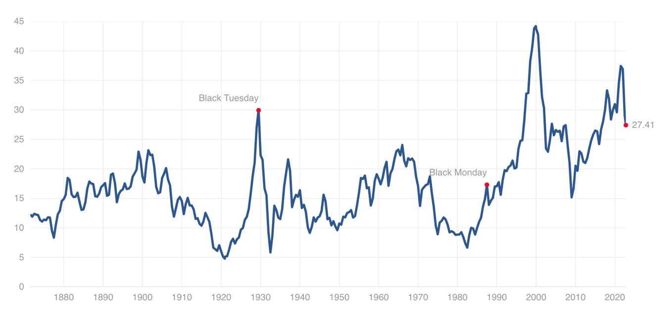
If you look at an “upgraded” valuation metric called Shiller P/E (Cape), which uses earnings adjusted for both economic cyclicality and inflation, the S&P 500 real valuation doesn’t scream that much of a bargain:
(To be fair, this isn’t exactly an apples-to-apples comparison because Shiller P/E doesn’t just adjust earnings for inflation, it takes earnings from the past 10 years to eliminate the skewing effect of economic cyclicality.)
But there’s also another way to gauge the stock’s inflation-adjusted valuation.
What if we inverse P/E?
If you flip P/E upside down, you’ll get a somewhat less-known metric called earnings yield.
It’s calculated by dividing earnings per share (EPS) by market price per share. And in theory, it shows how much you earn on each dollar invested in the stock. Think of it as the interest on bonds, just not fixed.
The “interest” you earn on the company’s earnings depends on P/E.
The higher the ratio, the more you pay for a slice of earnings. And in turn, you earn less. Conversely, the lower the P/E, the bigger slice of earnings a dollar can buy—which translates to a higher earnings yield.
In Q2 2022, the S&P 500’s nominal earnings yield was at 4.16%. That means if you invested in an ETF that tracks this index at today’s price, your investment would be returning just over 4% a year if the S&P 500’s price and earnings didn’t change.
But if you adjust that yield for today’s inflation (blue line), it falls deep in the red:
In the second quarter, the real earnings yield dropped to -4.48%, which is the lowest level since the 1940s. That means if companies don’t improve their earnings or inflation doesn’t subside, investors who buy in even at today’s depressed valuations will lose 4.5% a year in real terms.
Does the “nominal” S&P 500 valuation still sound like a bargain?
Stocks vs. bonds
With fixed-income investments, investors almost instinctively calculate how much bonds will yield after inflation. That’s because bond yields are expressed in percentage terms and you can simply do the math in your head.
With stocks, on the other hand, it’s less obvious. But now that we’ve already translated the S&P 500’s earnings into a yield, we can look at how their real earnings fare against safer bonds in a more apples-to-apples comparison.
Take the 10-year Treasury, which we’ll use as a benchmark for the “risk-free” return. Today it yields 4.1%—up from 1.6% as recently as this past January.
Now know where inflation is today, but where will it average in the next 10 years? You can use your hunch or look at surveys. But by far the most objective benchmark is the 10-year breakeven rate, which, in effect, tells us the average inflation the market is pricing in over the next 10 years.
Today the 10-year breakeven rate is at 2.45%, meaning that in theory, if you bought 10-year Treasuries today and held them till maturity, they would yield you 1.57% after inflation risk-free.
What about stocks?
As we just discussed, last quarter, the S&P 500’s earnings yield came to just a bit over 4.1%, which means stocks yield barely as much as risk-free government bonds. And if you adjust them for inflation as you do bonds, you’ll get basically the same yield.
In other words, equity risk premium, which is the excess return investors expect from stocks to compensate for higher risk, has vanished over the past year. And after two years of negative returns, government bonds are back in the game.
That’s key. As we showed in the Sep 29 MIM, the S&P 500’s forward P/E shows a near-perfect inverse correlation with 10-year real yields:
Of course, the earnings yield can change much more quickly than bond yields. But for that to happen, stocks have to show continued growth in earnings, which is unlikely considering recent downward revisions:
Otherwise, there has to be a contraction in valuations, which in this market climate is more likely.
The TARA regime is hard on stocks
I can’t find a better way to wrap up this letter than borrowing from what we wrote back in September 29 about the new TARA regime in the stock market.
As investment-grade bonds begin generating real income after years of negative returns, the market comes back to normalcy where investors have options to swap out overvalued equities with safer fixed income.
Goldman Sachs calls this turn of events TARA. “Investors are now facing TARA (There Are Reasonable Alternatives) with bonds appearing more attractive,” its analyst wrote in a recent note.
Will stocks manage to grow their earnings as much as to make up for the loss of their allure against growing bond income? Or contrarily, will we see a Morgan Stanley-predicted earnings recession, which will make stocks even less attractive?
Time will tell.
But if the Fed keeps its word on further hikes, bonds' allure against stocks will only grow. And in such an uncertain macro backdrop, the comeback of this safe haven could poach a lot of investors from stocks.


Well times have passed, and I think it's not gonna be another 3 lost decades. The U.S. stock market have to get out of the volatility storm and back into the sunlight in recover form.
Awesome stuff. I’m going to mention this article to my newsletter subscribers. Keep up the great work!